
The following series will be looking at a range of political parties in Victoria, leading up to the state election on the 26th of November. Pure design in politics is not something that is greatly explored or invested in when compared with advertising, messaging, communications and content. The following series is not a criticism of party platforms or policies and comments regarding design should not be read as either support or disapproval. There is also an understanding that different parties have different budgets, approval processes and infrastructure which make different ideas possible to some and not possible to others. These inequities have been touched on where possible. In this article we will be looking at the Victoria Liberal Party.
Words by Chris Dansie, Design Director at Hortenzia.

With Victoria’s political centre shifting more and more to the left over the past few decades, the right wing politics and conservative ideologies of the Liberal Party in Victoria have become increasingly unpopular. Historically, the Liberals have had a consistent and strong hold on Victoria, but the past forty years have seen an increasing generational disconnect. With the Liberals refusing to pursue a socially progressive agenda that reflects the Victorian community, the brand of the Victorian Liberals is now extremely unpopular in Victoria. In understanding that they’ve fallen out of favour within Victoria, they have made the interesting choice in the upcoming state election to communicate their brand without their logo - the complete opposite of what any branding material should do.
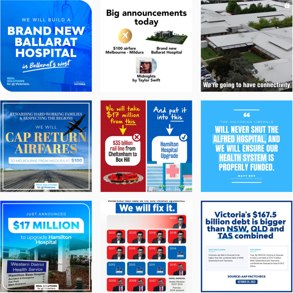
The Victoria Liberal Party campaign design is encapsulated by shades of blue and a leaf-shaped graphic device. The leaf-shape is their strongest brand asset and the only design device they use. The hard corners transposed by rounded edges is a physical representation of softening a message and makes the Victorian Liberals appear more approachable. They use this graphic device in positive messaging and it is an effective device that can easily be applied to many graphics across a variety of mediums. The shape is derived from their “L” logo mark and is a reference to the three square shapes that compose the logo.
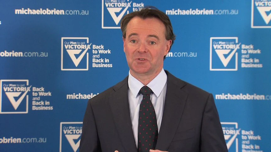
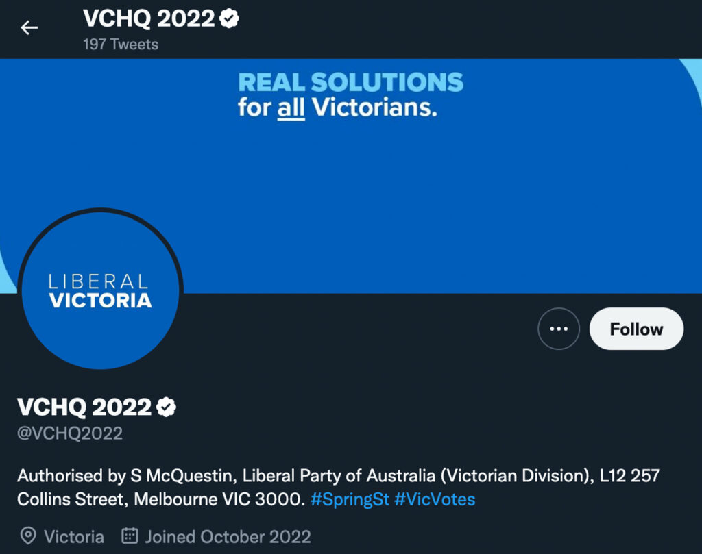
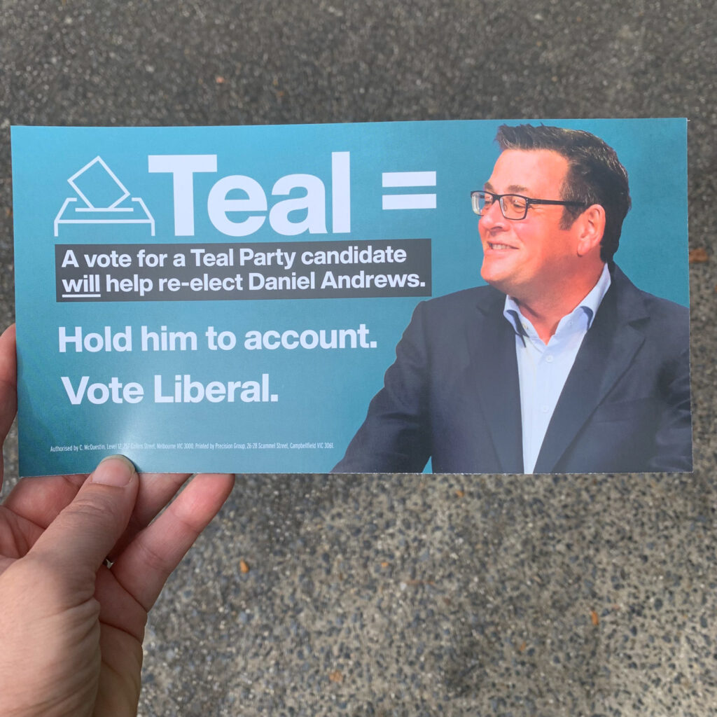
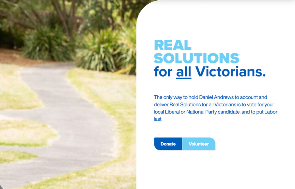
In the 2018 state election the Victorian Liberals were reduced to the second smallest parliamentary representation since 1952 (with 2002 being the smallest), and have only held government for 12 years of the past 40 in Victoria. The recent federal election reinforced the reality that the Liberal brand is not liked in the Victorian community, with the federal liberals only holding one seat in the state. But as the state election draws near, the Victorian Liberals have chosen an interesting campaign choice by intentionally removing the Liberals logo from all materials. This first started with removed opposition leader Michael O’Brien using the “Our Plan to get VICTORIA Back to Work and Back in Business” logo rather than the Liberal Party logo whenever he appeared in public. This lack of logo is also present across numerous examples of their campaign materials including banners, flyers and pamphlets. Their Twitter account doesn’t even use their name in the handle - instead their handle is “VCHQ 2022” and the profile picture faintly reads LIBERAL VICTORIA. The Liberals are making a mistake by refusing to address the reason they are so inherently disliked in Victoria by slapping a bandaid over their logo and disconnecting the Liberals’ logo from their promotional material. Instead of hiding their brand they should redefine it; a political campaign without a political party is oxymoronic. Changing the perception of their brand is the first step to reestablishing the hold they used to have over Victorians.
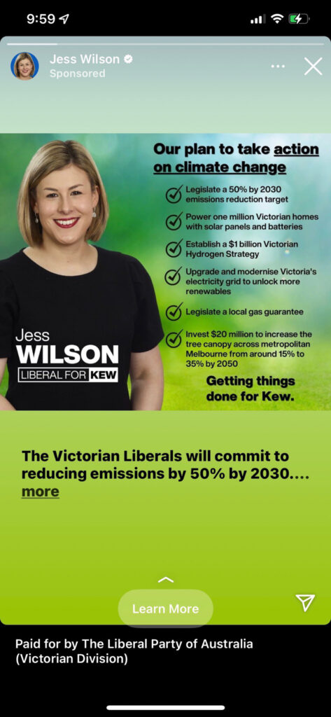
Their branded material incorporates light blue and dark blue shades used together, and the combination helps to display a softer message yet vibrant feeling. They own the branding of the colour blue and that in itself is quite powerful. However the negative perceptions towards the Victorian Liberals’ policies have seen them straying away from using blue. Instead some candidates have even adopted teal or green colours in seats that are under threat by climate conscious teal campaigners. The Kew electorate vacated by Tim Smith is being filled by Jess Wilson, and it is one of these electorates where material is produced with colours of teal or green signalling a care for the environment and climate.
The combination of removing their logo in branded material, mimicking minority parties in their colours and talking about Dan Andrews incessantly makes the Victorian Liberals appear insecure and untrustworthy. Impersonating other minority and independent groups proves to their target audience that the Victorian Liberals themselves are not confident in their own values and beliefs, and it most certainly doesn’t instil long term confidence. Instead of fighting their own branding the Victorian Liberals should use design to redefine what the Liberals stand for.
Design-wise, their branding doesn’t resonate with what the Victorian Liberals stand for. The Victorian Socialists and the Greens use typography on a diagonal axis to represent their progressive ideologies. Even the Liberal Democrats use a flame symbol and yellow and black colour palette to link back to their Libertarian ideologies. But with the Liberals there is no deeper meaning or messaging behind their design. A lot of their material is focused on Dan Andrews and they run campaigns on removing government rather than electing the Victorian Liberals. When it’s not focused on tearing down Dan Andrews, the imagery is trying to raise the profile of the opposition leader Matthew Guy, who is perceived unfavourably in Victoria.
Throughout their social media the typeface is inconsistent across every single design item. As a party of government, the Liberals produce much more material across a wider area of policy so understandably there is a wider variety of information that needs to be communicated. However different styles of posts shouldn’t equate to inconsistent branding. Consistency in typography instils brand authenticity and better brand recall - a social media post should be able to connect with a polling booth sign, because ultimately this connection will lead to more votes.
The inconsistency of the Victoria Liberals Party branding over the past few years have left them between a rock and a hard place. Their brand is more likely to do well when it’s not associated with their logo, but in the long term they will suffer from reduced brand confidence. Design is an effective tool that can be used to improve social standing within the wider community, and in the long term that stigma change is more valuable than trying to hoodwink Victorians for spare votes.