The following series will be looking at a range of political parties in Victoria, leading up to the state election on the 26th of November. Pure design in politics is not something that is greatly explored or invested in when compared with advertising, messaging, communications and content. The following series is not a criticism of party platforms or policies and comments regarding design should not be read as either support or disapproval. There is also an understanding that different parties have different budgets, approval processes and infrastructure which make different ideas possible to some and not possible to others. These inequities have been touched on where possible. In this article we will be looking at the Victorian Greens.
Words by Chris Dansie, Design Director at Hortenzia.

From humble beginnings as a party passionate about the environment, The Greens have now transformed into a socially progressive party supporting a variety of disadvantaged groups within society. Over time they have become a household name in the political scene and their design language has evolved to reflect the incorporation of these broader issues, backed by the strong visual of a green triangle. Yet for a community-focused and socially conscious party, their branding screams ‘corporate fun’. And as they move to target the younger demographic, their message is lost behind their colourful and playful designs. The result is a brand with disjointed and incohesive branding across their multiple touchpoints.
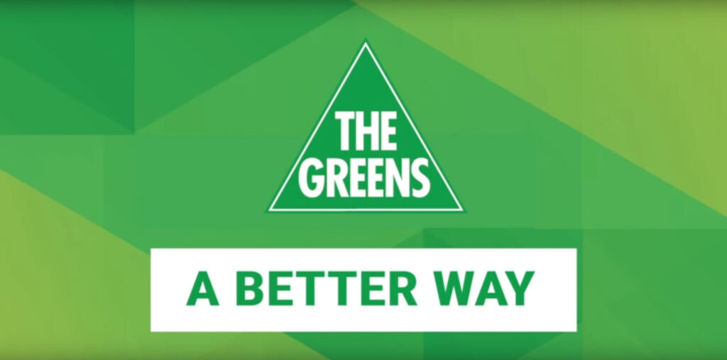
The Greens use green as their primary colour, nodding to their roots as an environmental organisation and connoting their progressive ideals. Technically speaking, green is one of the hardest colours to reproduce across different screens and print material - with this being the case, they use a variety of greens throughout their material which allows tonal changes to go unnoticed. This is a clever decision to create continuity without extra costs - think yard posts, posters, stickers and brochures which all use different types of stock with different finishes, produced by different printers. This type of reproduction is difficult and costly when sticking to one specific colour.
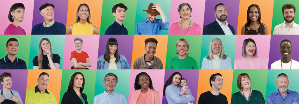
Whilst green is the primary colour that dominates The Greens’ touchpoints, they haven’t restricted themselves to just that one colour. Throughout their collateral they have also introduced pink, purple and orange to create a strong brand that is visually appealing on screens, where their primary target audience of Millennials and Gen Z will see it. They use colour in a sophisticated way by treating images with their colour palette, a device used for turning stock images into branded material.
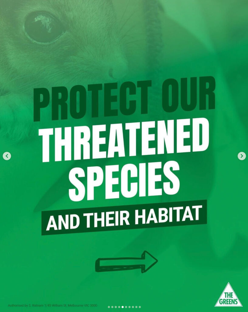
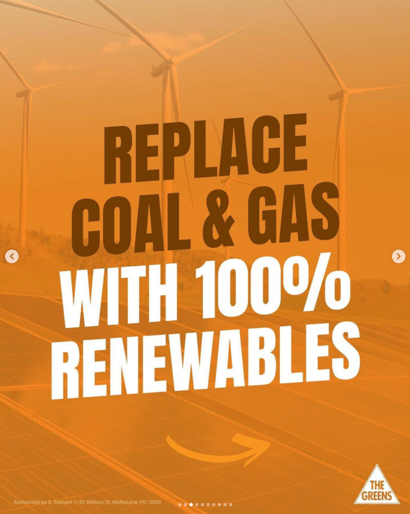
Typographically, the Greens selected a bold capitalised typeface that matches their strong beliefs and progressive politics. Their typeface, Anton by Vernon Adams, is supported in many languages which ensures it is accessible to many different communities. The use of typography on a diagonal axis is used throughout their collateral, a clever device that is used by progressive political parties around the world. When pieced together, the marriage of colour, an inclusive typeface and progressive graphic devices strongly position The Greens as Australia’s third largest political party.
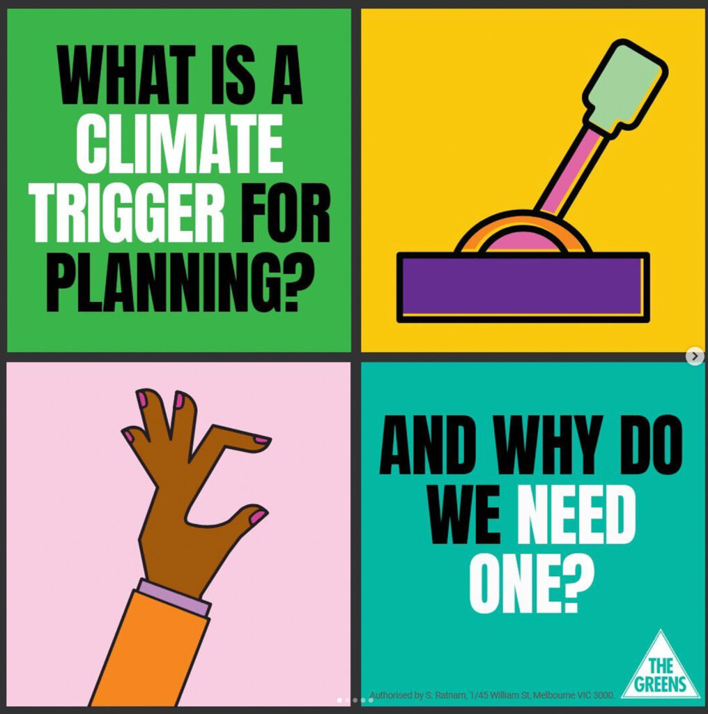
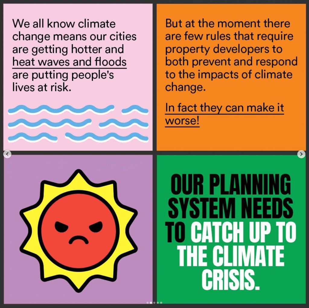
With a target demographic of Millennials and Gen Z, The Greens have tailored their design by using illustrations and bright, playful colours across their social media. Despite discussing heavy topics such as climate change and deforestation, they communicate these serious messages in a fun and cheerful way. This style of communication can come across as condescending and disingenuous towards their target audience, while also muddying the message they are trying to communicate. It’s not that colourful and simplified communication can’t be used, it works well on social platforms to provide bite-sized snippets of information in the form of instagram posts or carousels, or a short TikTok. But the way in which The Greens have designed these tidbits are too childlike. The Greens need to find a middle ground where their visual language is appealing to younger audiences on social platforms yet can still speak about negative ideas, instead of creating a fun image and hiding all the serious details in the caption. A great example of serious messaging fit for social media can be seen on Cheek Media’s instagram.
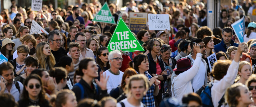
The Greens’ triangular lock-up logo is distinct from other parties’ logos and easily identifiable. When done well, symbol-based brand identities are more powerful than type-based ones - they clearly communicate brand associations and are more recognisable. The Greens have moved away from the triangle as a graphic device throughout their identity, which is a missed opportunity as it would be the most advanced identity in the Australian political arena if used well. The opportunity to look at a triangle and immediately associate the symbol with The Greens is powerful, and they should take advantage of it by incorporating the triangular visual device into their identity toolkit, rather than purely as a logo.
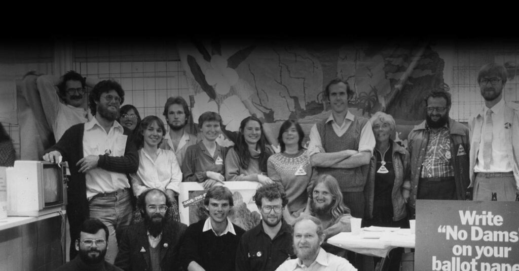
The Greens have slowly grown over the past thirty years through a grassroots approach to democracy. Despite their wildly progressive ideas in a not-so-progressive Australian political landscape, they have successfully established themselves and become the third largest party. Where they have an edge is with their triangular identity, and using that will be the key to solidifying their place in the minds of Australians.
