
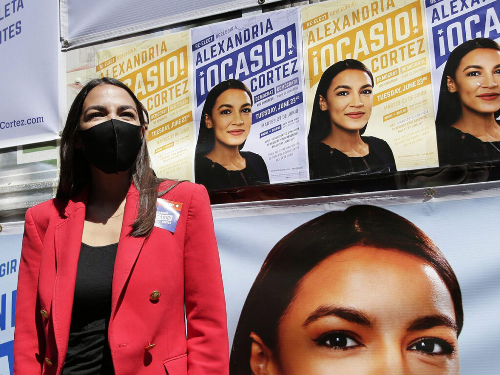
The success of Alexandria Ocasio-Cortez’s 2018 political campaign catapulted a new era of progressive political design, hallmarked by typography on a diagonal axis. Whilst there is a lengthy history behind typography on a diagonal axis in design stretching as far back as communist posters, the reasoning behind AOC’s success lies in the resonance with her campaign messages. Now this style of design has become synonymous with progressive politics shared by politicians all over the world. There is a mutual coexistence where, one way or the other, design informs politics and politics informs design.
It’s safe to say that identity design has transformed over the past two decades with the emergence of new media and new forms of communication. Typography on a diagonal axis is one form of design that encapsulates motion; and in 2022, stagnant messaging no longer has a place. Visual communication is based on rules and structural design systems, and typography is no different. The typography creates the visual idea of dynamism and movement through its composition along a diagonal axis, usually moving from bottom left to top right. Through this dynamic composition it becomes a symbol for progressive politics in the way that it is literally looking up - it becomes synonymous with hope. From a design perspective, the idea of taking text off the x axis is radical as most text that people consume is on a horizontal axis.
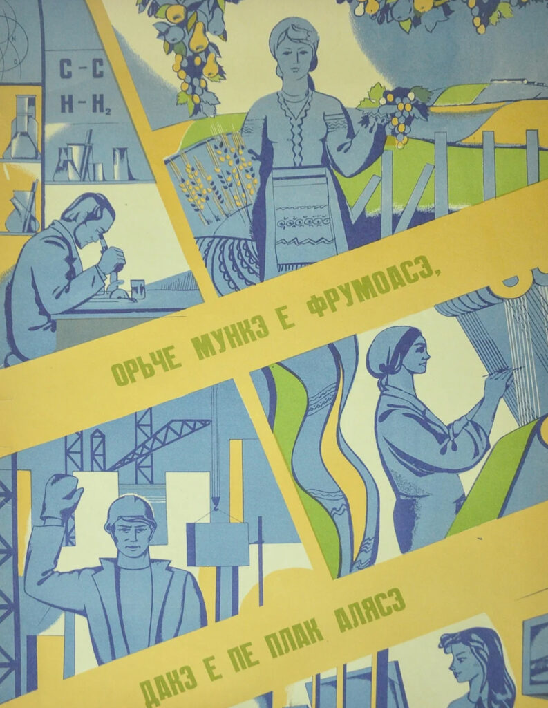
Typography on a diagonal axis has a history within left wing political ideologies, counterculture movements and now progressive politics. It can be seen in Soviet and communist propaganda - this particular one encourages women to read and work to meet government production plans. It also appears in punk culture, as shown on UK band Sex Pistols’ studio album Never Mind the Bollocks, Here's the Sex Pistols. The album was radical for its time due to its raw energy and Johnny Rotten's sneering delivery and half-singing - despite this it would go on to influence many bands and musicians. Artist Barbara Kruger also made regular use of typography on a diagonal axis in her work, questioning social constructs and the mainstream media’s portrayal of power, identity and sexuality. Its usage throughout history is littered with progressive and radical ideas.
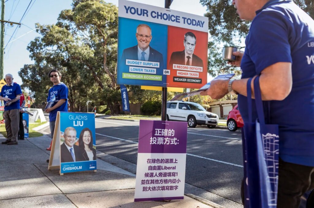
Across all political campaigns in Australia, one thing stands out - the design is lacking. Graphic design in Australian politics hasn’t been explored much beyond mundane design elements such as colour: blue = Liberal, red = Labor, green = The Greens. The introduction of the ‘teal independents’ features a combination of blue and green, and represents their Liberal values that incorporates environmentalism at the forefront of their politics. Colour is only one of many design tools that can be used for communication and yet it is the only driving force behind Australian political design. In its stead, content production agencies, ad agencies and campaign specialists dominate the creative and visual language of campaigns and stories. A recent example is the 2019 Scott Morrison campaign produced by Topham Guerin, a campaign and political content consultancy, that ‘weaponised boomer memes’ by rapidly churning out content and sidelining design and quality for speed and relevancy. Where Australia lacks design, it makes up for it by using different forms of communication.
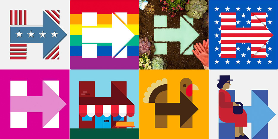
When compared to the American political design scene, the possibilities of design in the political arena are better showcased. American politics is rampant with personal brand and visual identities for the various candidates. Aside from AOC, another great example of political design is Hilary Clinton’s 2016 election campaign design. Designed by graphic designer Michael Bierut, a partner at design consultancy Pentagram, he designed a logo that featured a square ‘H’ with an arrow across its middle. It went beyond what previous American campaign designers had created; it didn’t rely on overused symbols such as country/state shape, stars or stripes. The logo formed the basis of a dynamic identity design system that could be repurposed to suit the needs of the campaign. Beirut described it as "the ultimate dynamic identity system."
What we’ve seen over the past few elections is that design and politics do interact; and that design has the capacity to impact society. Everyday, people align themselves with products and brands that fit the image of their personal identity, whether that’s through the clothing they wear or the gym they choose to attend. Aligning one's personal identity to a politician, party or movement is no different, and design elements like typography on a diagonal axis help to establish political ideologies and shape people’s decisions.
Words by Chris Dansie, Design Director at Hortenzia.