
Rebrands come in all shapes and sizes, from complete rebrands to small brand updates and seasonal campaigns, a brand’s evolution can take many forms - and there’s no right or wrong path.
Rebrands often occur when a company or organisation needs to evolve, grow or take a new direction. The need to rebrand could be driven by an interest in repositioning within current markets, trying to expand into a new market or wanting to broaden your audience. Rebrands may also take place if there is new management or a merger between companies or if the brand is overcoming some negative press. Rebranding takes a lot of thought, consideration and usually a couple of iterations to get right, but the results can drive growth and move the company into the target position. Visually, some brand elements may need to stay to ensure that the existing customer base are not polarised by the changes. The things that stay and go need to be thoroughly considered. While it may be costly and time consuming to rebrand, a failure to do so may lead to losing the attention of your customers and a resulting decrease in sales or market share.
Rebranding isn’t just about creating a new logo, it’s about changing the company’s brand positioning, strategy and perception amongst consumers. The goal is to influence the way that customers feel about you. This could mean a new brand identity which is a significant change visually, or it could mean altering your internal brand - new values, messaging or mission statement. Most of the time, it’s usually a bit of both.
We're taking a look at some of the best recent brand updates by some of the world's largest brands - and if you want a look at the other end of the spectrum, see 'How To BoM A Rebrand' for the Bureau of Meteorology's not-so-good complete rebrand.
First things first, how do rebranding and a brand refresh differ?
Rebranding is a more time-consuming and involved process, auditing every aspect of your current brand and marketing strategy and streamlining them to better serve your future goals. A rebrand will solidify your positioning as well as your visual identity, both internally with staff and externally with consumers.
Conversely, a brand refresh, includes “polishing” elements of the existing brand. This may be suitable for an existing brand that doesn’t need a complete update, meaning a small ‘refresh’ is adequate. These updates could include a subtle change of logo, adding new elements to an identity system, a new website, new art direction or new marketing strategy. They could be motivated by a need to modernise or a strategic shift that is required to adapt or solidify the brand internally.
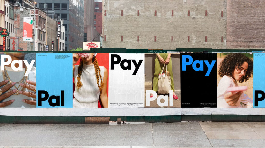
PayPal have recently completed a rebrand with the help of one of the world’s best design agencies, Pentagram.
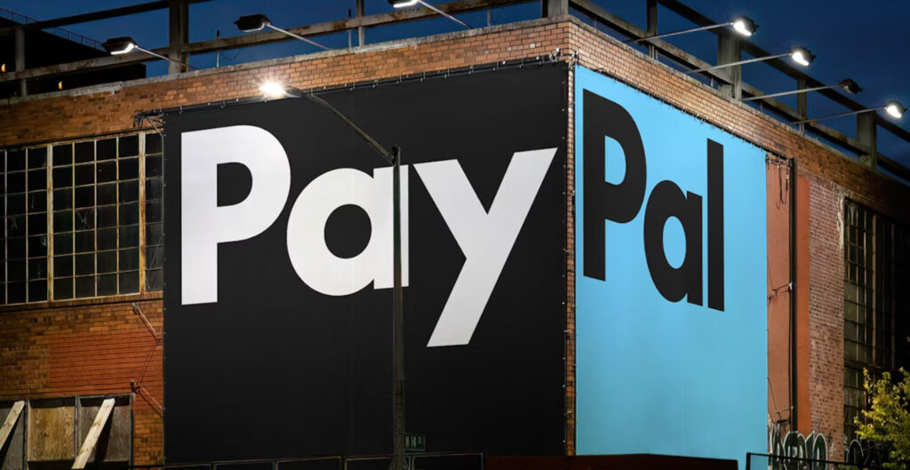
After 25 years of sporting an italicised blue logo, they’ve moved to a more sleek, corporate option, elevating the brand and broadening its appeal without taking away from its heritage. The perfect combination of new and old, maintaining the italicised P’s (with less curves) as the brands motif and sharing a completely separate word mark. Contemporary and warm, it’s refreshing to see that they have finally completed a full rebrand after creating only small updates to the brand for the last 15 years.
PayPal has been revolutionising the way we handle money over their double decade span, allowing people to move money, sell and shop in a simple, seamless, personalised and secure way. They have nailed their move to a more simple and contemporary look, making their brand more accessible to “everyone, everywhere” as the rebrand launch coincides with the new PayPal Debit Card.
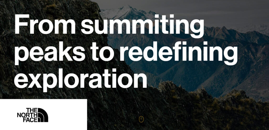
But sometimes it’s not the branding that needs an update, it’s the messaging. This can be seen with North Face, who have made a name for themselves as a quality outdoor clothing brand. The problem was that they were limiting their reach by giving the perception that you had to be out “exploring” climbing mountains for their apparel to be suitable.

Their interest in scaling globally meant that they had to expand the context of the word “exploration” to not only one of physical feats but to the journey and exploration of the self, allowing them to broaden their audience and serve more people. This change has led to an internal update, with “exploration” days for employees and more meaningful messaging and engagement with consumers and communities leading to more growth worldwide. After all, most of the people you see wearing a north face jacket are more likely to be walking to work than climbing a mountain.
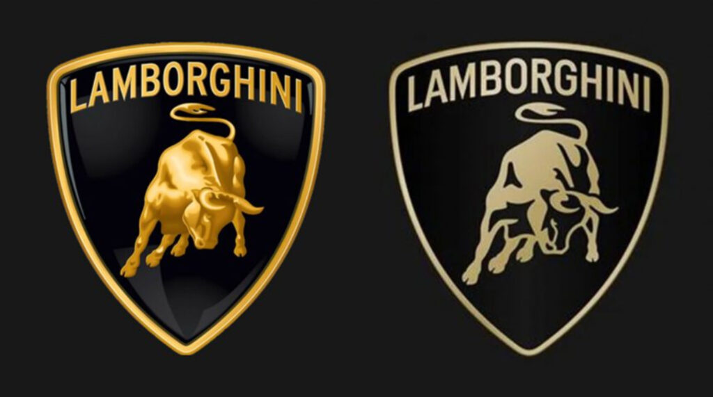
Another brand that updated their identity after 2 decades is luxury car brand, Lamborghini. As opposed to Paypal’s complete rebrand, Lamborghini opted for a modernised version of their current logo, updating it to a flat, simplified mark to reflect their move towards sustainability and decarbonization. The logo still has the same setup with a bull placed at the centre of a shield but the bull is now a mere silhouette paired with a broader, thinner typeface across the top. The luxury brand’s logo holds so much value that a complete change would be an unnecessary risk, and opting for a subtle refresh achieves the same outcome without the risk. For the first time in the company’s history, the bull will be used individually on their digital media, giving the bull even greater prominence and showing their interest in moving with the times. A move that aligns with their plan to build the first fully electrified Lamborghini by 2030.
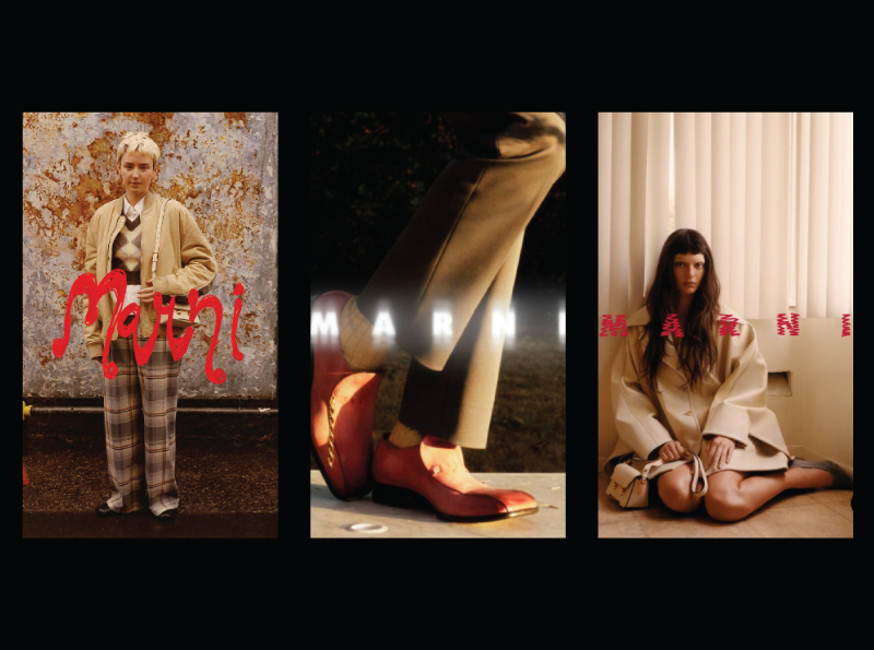
And then there's Marni - a fashion brand that does branding differently…by creating a new logo with every drop. Boasting strong brand value, their logo and identity adapts with their seasonal campaigns to be current and trending. As a result, the brand has become synonymous with constantly evolving and being “different”. It also provides the opportunity to identify with the latest trends without committing to a new identity, keeping it up-to-date and on the money every season.
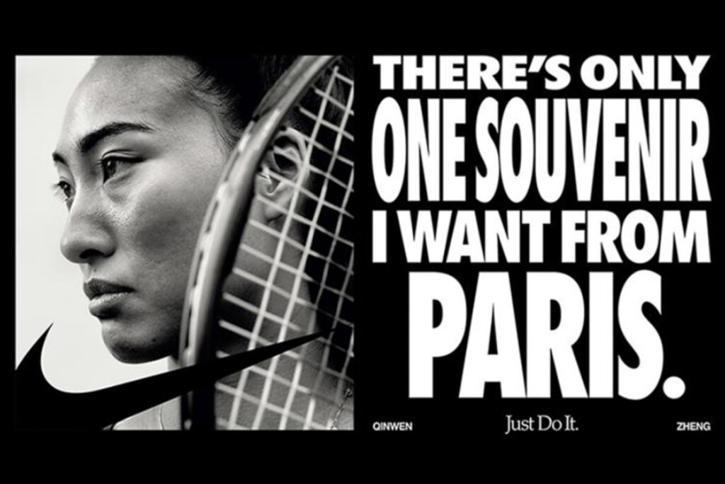
And finally Nike, who needs no introduction. They are one of the most recognised brands in the world and the most valuable apparel brand - and for good reason. They “Just Do It”. Nike constantly release campaigns that are intelligent, design-led, disruptive and boundary pushing, keeping them at the top of their game.
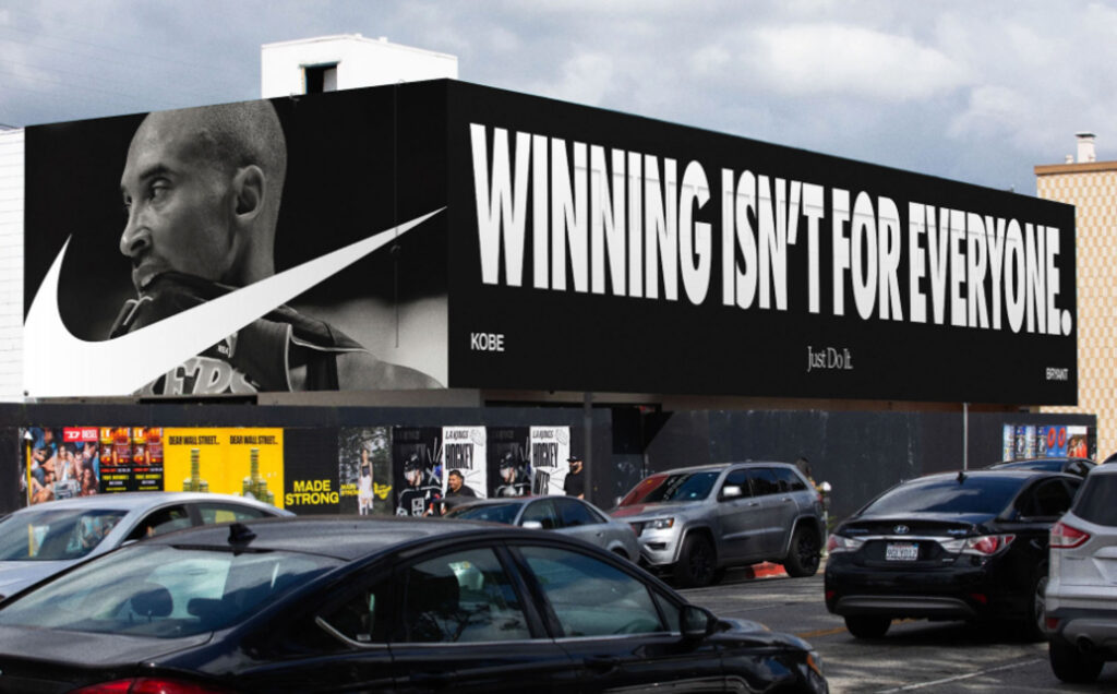
After a complete rebrand in the 70’s giving them the famous swoosh logo, Nike have refrained from changing their branding and instead have made small adaptations and additions, including the aforementioned “Just Do It” tagline created by Weiden + Kennedy in 1987 for a series of the brand’s first major TV ads. Their focus on campaigns have given us some of the best ads ever created, from Michael Jordan’s ’Failure’ in 1993 to ‘Find your Greatness’, in 2012 pushing ordinary people to reach their goals, to "Dream Crazy" featuring NFL quarterback Colin Kaepernick in 2018.
Their most recent campaign for the Paris Olympics “Winning isn’t for everyone”, embraces the ruthless drive it takes to be a top athlete with a series of visually striking print and digital ads. They positioned the campaign as an opportunity to reclaim sharper and bolder marketing after losing market share to smaller upstart brands in recent years.
The takeaway?
If you can develop a brand with enough value, you can use your campaigns as a way to stay contemporary, shift ideas and be different without changing your brand. In 2024, an adaptable brand that has the ability to hold value across every touchpoint is key, but you need the backing of a good strategy and brand identity to make this work. Start with the foundations of a strong brand, and work your way up - but don't be left behind.