Microsoft has recently introduced font family Aptos, previously known as Bierstadt (Beer Town in German), as the new default font for the Microsoft Office Suite. Aptos has replaced Calibri as the default font of Microsoft 15 years after its introduction. This new rollout means that Microsoft’s user base, in the 100s of millions of active users each month, will have an automatic update to the design of their documentation, presentations and spreadsheets - without even having to click a button. The announcement is a welcome change that will fast forward the design output of these non-design applications, without their users even having to make a conscious decision.
The Microsoft Design Team released 5 new custom typefaces in April 2021: Tenorite, Bierstadt, Skeena, Seaford, and Grandview, hoping to find the next default font for the Microsoft Office Suite. Two years later, the new default font went to Aptos - which was known as Bierstadt in the list. That decision also marks an end to the usage of Calibri since its introduction 15 years ago with Windows Vista.
The type designer behind Aptos is Steve Matteson, whose works are described as ‘humanistic’. His other famous works are Segoe, the typeface used in Microsoft’s new logo; Droid Sans, which was an early Android system typeface; and its successor Open Sans, which is the second most used typeface on Google Fonts with more than 95 million websites featuring it. It’s hard to comprehend the prolific number of eyeballs that have viewed Matteson’s work, most without even a second thought or acknowledgement, and important to understand the impact that designers can have on the zeitgeist.
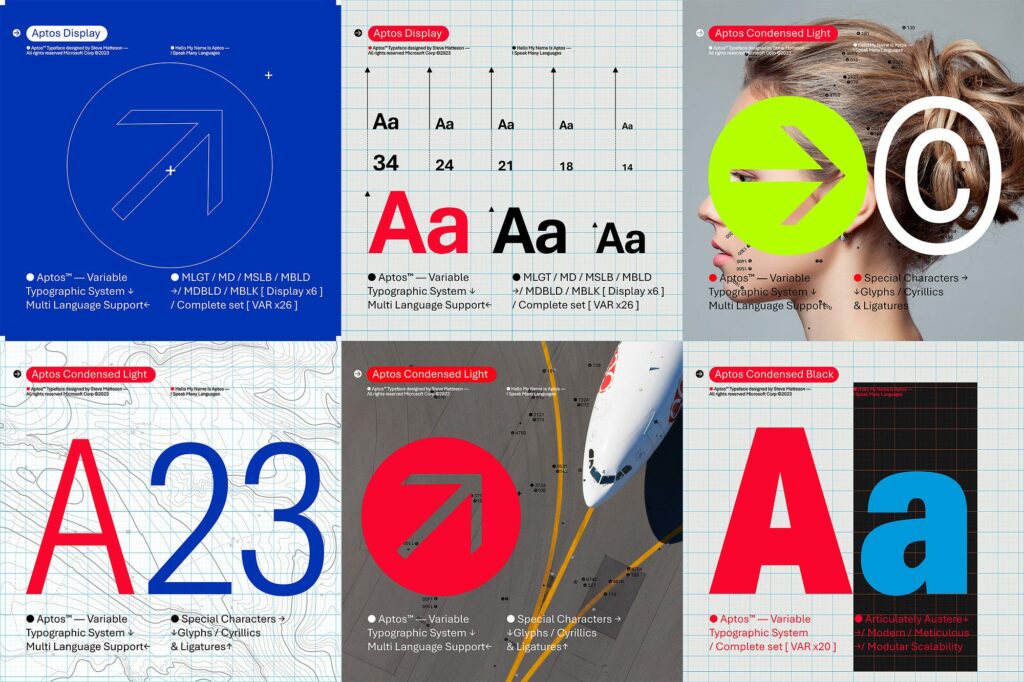
Aptos, according to its designer Steve Matteson, has its root in the grotesque sans genre - the most recognisable example would be Helvetica. He stated that “Bierstadt (Aptos) is systematic and neutral – but includes nods to the early grotesque typefaces including its two-looped ‘g’ and an elegant tail on the ‘R’.” However, Aptos is also beyond grotesque. It has the warmth of humanist touch in its open interior of letters, called counters, which makes it legible even on smaller sized screens. The clean cut stem finishes with right angle ends which contrasts with another iconic Microsoft typeface, Arial.
With the rollout of Aptos as the default font family in the next few weeks on the most widely used software applications by Microsoft, the impact it will have on its 345 million users is subtle, yet very powerful. The choice and usage of a font is one of the basics in design discipline, but not always the same in other practices - quality default typefaces allow for an elevation of design within society without effort or consciousness which has flow on effects of raising the standards of design throughout culture and society.