
Words by Chris Dansie, Design Director at Hortenzia.
The following series will be looking at a range of political parties in Victoria, leading up to the state election on the 26th of November. Pure design in politics is not something that is greatly explored or invested in when compared with advertising, messaging, communications and content. The following series is not a criticism of party platforms or policies and comments regarding design should not be read as either support or disapproval. There is also an understanding that different parties have different budgets, approval processes and infrastructure which make different ideas possible to some and not possible to others. These inequities have been touched on where possible. In this article we will be looking at the Victorian Labor Party.
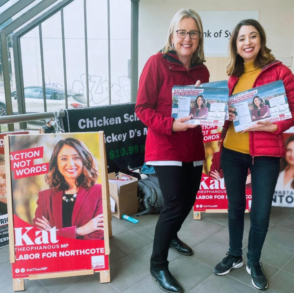
The Victorian Labor Party’s influence within Victoria has steadily grown over the last forty years; a result of the shifting demographic that would eventually push the Victorian Liberal Party to the fringes. But unlike the Liberal Party, the Victorian Labor Party has a strong brand and heavily conceptual communication material. Out of all the political parties, their communication design is refined and sophisticated; they effectively target different audiences within their demographic. However their design falls short when it comes to their printed campaign material. The lack of consistency devalues their brand and message.
As one of the two major parties in Australia, the Labor Party is easily recognisable by its red colours. They use red and white throughout their materials however there is no consistency, defined amount of red or graphic devices used with the colour. The Victorian Labor Party are simply relying on the established idea that red = Labor without going the extra mile to develop a graphic device out of it. The Greens have an edge over Labor in this area as they actually incorporated different shades of Green as a branding device. For Labor, colour is secondary to imagery and design - a wasted opportunity given that they are so heavily associated with the colour.
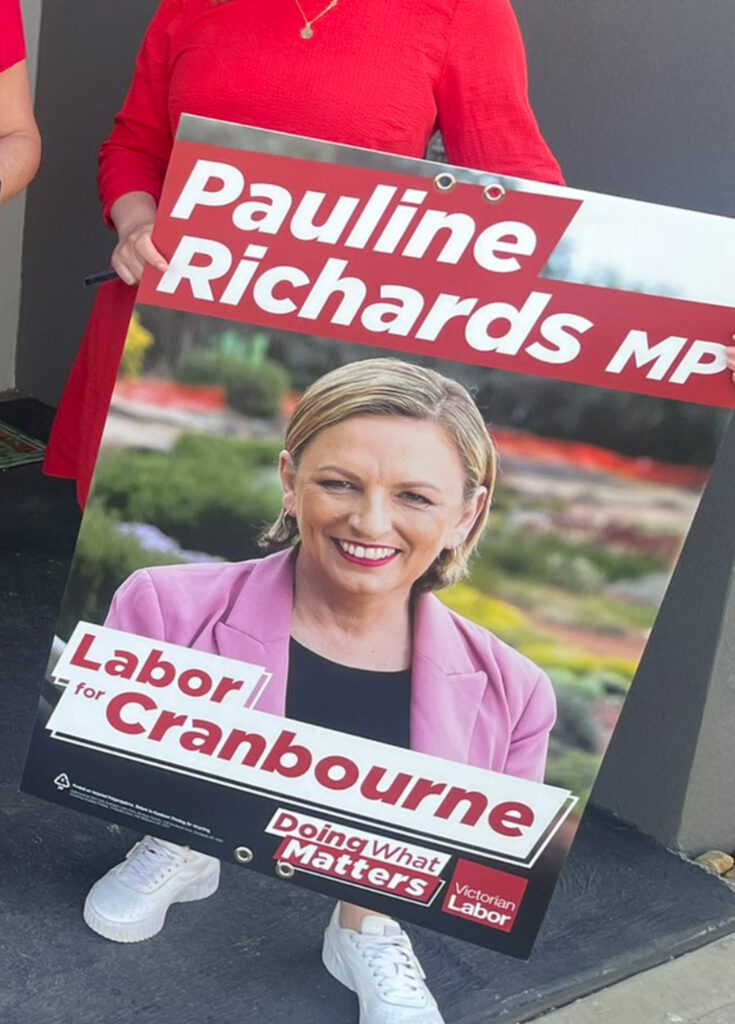
Across candidates and campaign collateral there is a distressing lack of typeface consistency. Designs appear to be made with whatever font suits the specific material. There is a mixture of three different bold typefaces being used, a selection of hand drawn types and serif typefaces. Serif is a particularly interesting choice that is uncommon for political parties due to readability issues. Their ability to target different audiences, such as using typography on a diagonal axis when communicating with younger progressive audiences, provides great flexibility for the Victorian Labor Party however it does little for building brand consistency.
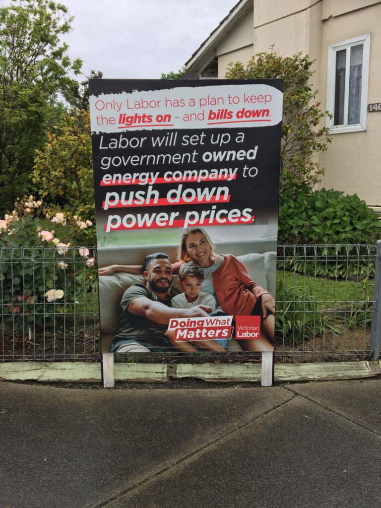

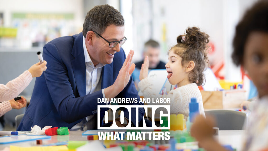
For this campaign the Victorian Labor Party’s slogan is ‘Doing What Matters’. The slogan is to the point and does the job, however their implementation is poor. There are two different lockups that the Victorian Labor Party have chosen to roll out. The one that is used primarily has the slogan written on a diagonal axis, in line with popular progressive visuals. It combines different text weight, different coloured text, different coloured backgrounds and a drop shadow key line. Within the one lockup there are too many different ideas and competing components, and it drowns out the messaging and impact.
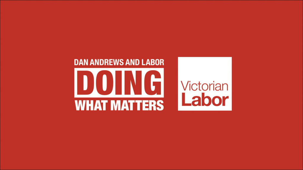
The other lock up for the slogan is a solid stamp style and it falls more in line with the Victorian Labor Party’s branding over the past four years. Given its appearance as a stamp, it could have conceptually been implemented as a ‘stamp of approval’ across different policy announcements, letting their audience know that the Victorian Labor Party is ‘Doing What Matters’. The second device is a much better and more efficient communicator of the two.
Within the scope of their branding, their strongest area is imagery. They use a diverse range of people and communities, prioritising representation to ensure that the people they target can relate to their messaging. As a party that says they’re for the collective, their strong visuals and diverse imagery is an honest first insight into what the Victorian Labor Party really cares about - the people.
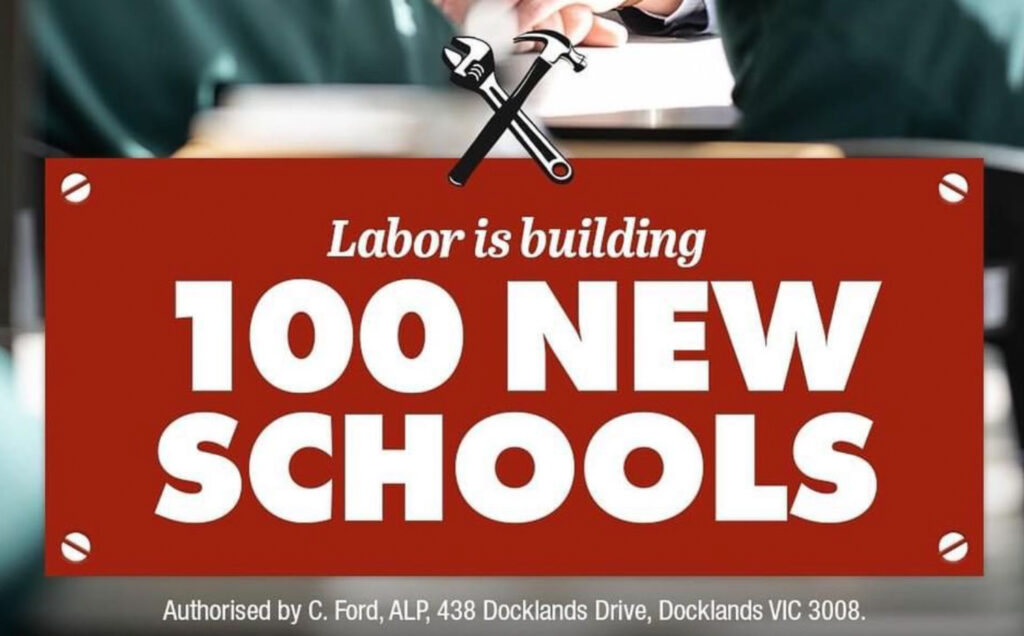
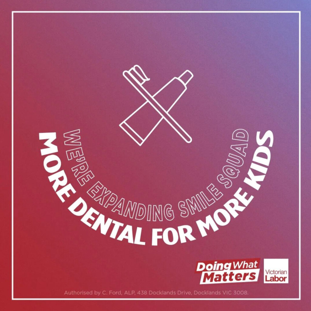
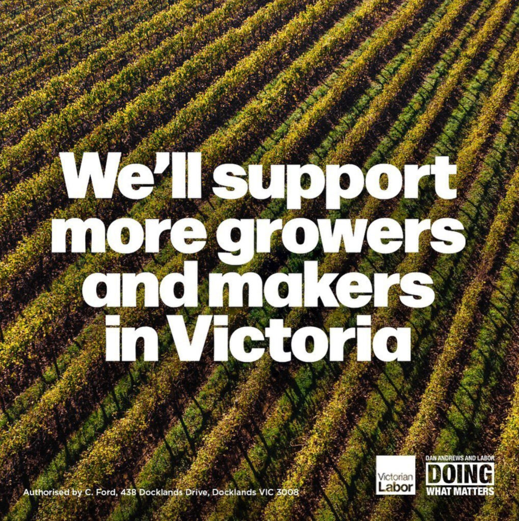
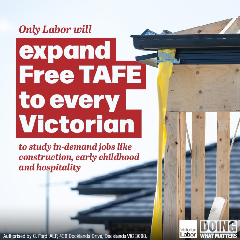
When it comes to their individual messaging across a variety of audiences, the Victorian Labor Party are the most advanced out of all the political parties. The Victorian Labor Party uses layered design and conceptual thinking in their approach to creating communication material, and this is especially evident throughout their social media. In the social post discussing building 100 new schools, the corners of the ‘sign’ is screwed in, linking back to their plan to build. When they introduce more dental they mould the type into the shape of a smile. They use conceptual design better than others and are not afraid to lose different design elements in favour of their overall message being reinforced. The childcare announcement trades off between being able to read the details and presenting a conceptual design that not only pushes their message but also pushes the boundaries. Like their slogan, their design is bold and direct and echoes what they stand for. As a party that is moulded around the idea of saying what they’ll do and doing what they say, this is a successful execution of design matching their ideals.
As a whole, there is a big difference between their designs for online platforms and print designs. Whilst it’s great that they understand their audiences and design specifically for each demographic, it doesn’t hide the fact that their branding lacks consistency. If they could unify their visuals better then the Victorian Labor Party would be well placed to solidify their strongly established brand and smart design.