
The following series will be looking at a range of political parties in Victoria, leading up to the state election on the 26th of November. Pure design in politics is not something that is greatly explored or invested in when compared with advertising, messaging, communications and content. The following series is not a criticism of party platforms or policies and comments regarding design should not be read as either support or disapproval. There is also an understanding that different parties have different budgets, approval processes and infrastructure which make different ideas possible to some and not possible to others. These inequities have been touched on where possible. In this article we will be looking at the Liberal Democrats.
Words by Chris Dansie, Design Director at Hortenzia.
The Liberal Democrats are one of various micro parties that fall within the hard right wing community in Australia. Whilst promoting Libertarian ideals that would see the government removed from people’s lives and creating a free market in more industries, their campaign design ironically fails to present the best part of a free market: innovation. Their recent rebrand is poorly rolled out and the design is basic at best. Riding off of political movements created by others, they are missing an opportunity to create their own political movement by producing their own symbolism.
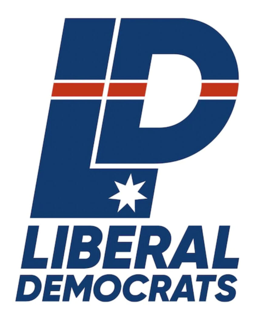
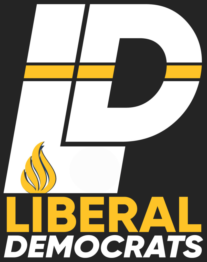
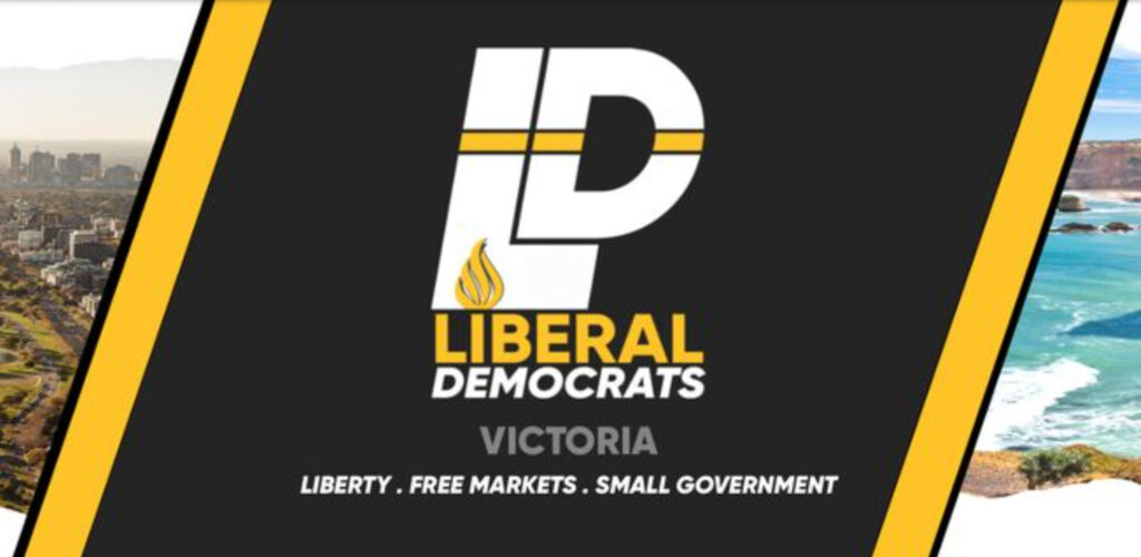
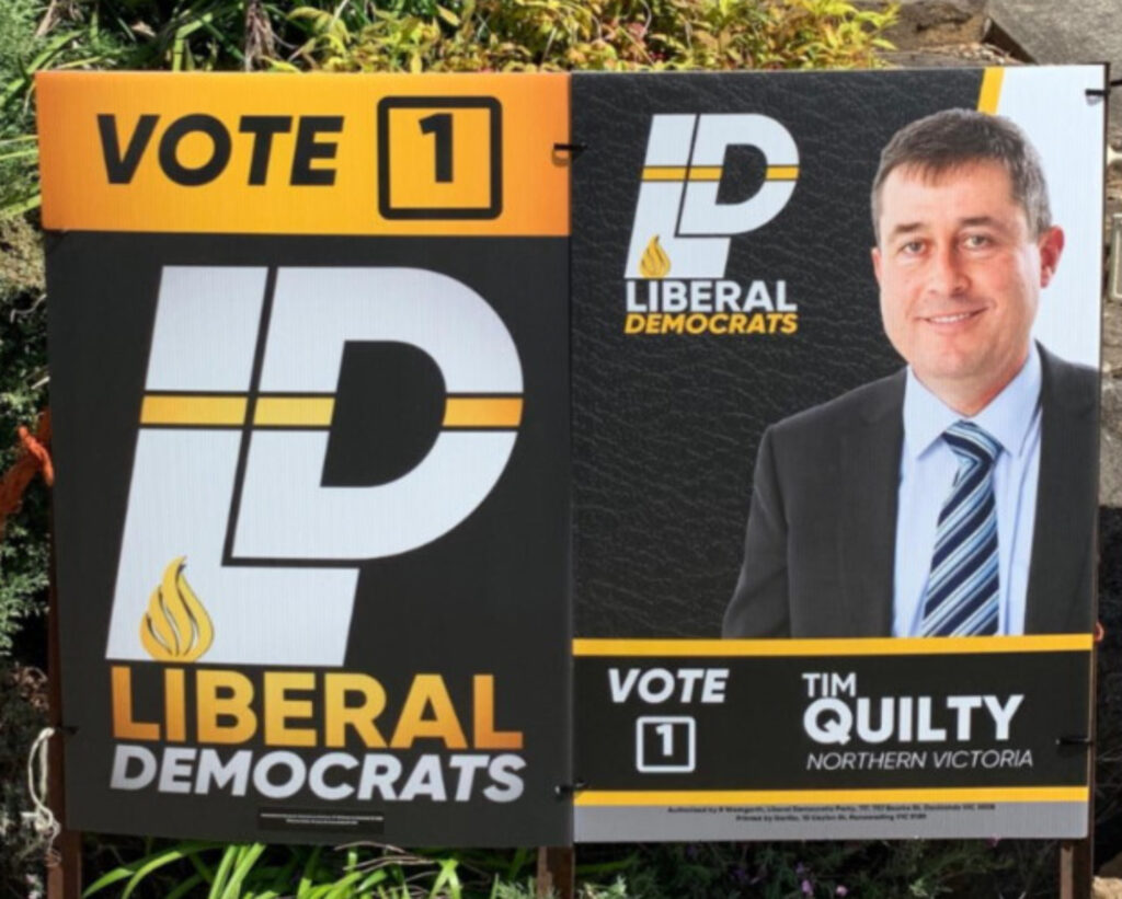
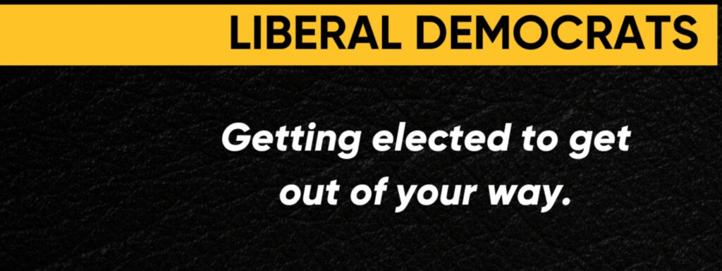
Their brand update three months ago saw a shift away from a blue and red colour palette with a star symbol to a yellow and black colour palette with a flaming torch symbol. The flame symbol is a direct reference to the liberty torch shining the light towards freedom and leading to liberty and enlightenment. The colour change is an important detail in their political identity evolution; the shift away from their original blue suggests a desire to move away from the Victorian Liberal party. Instead they have opted for a bold black and yellow that helps differentiate themselves from other microparties in a crowded right-wing space.
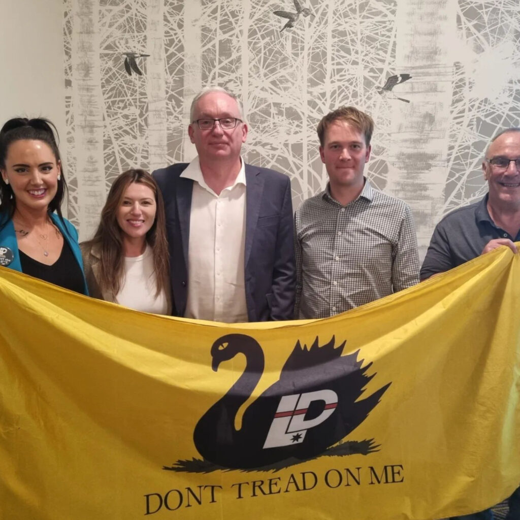
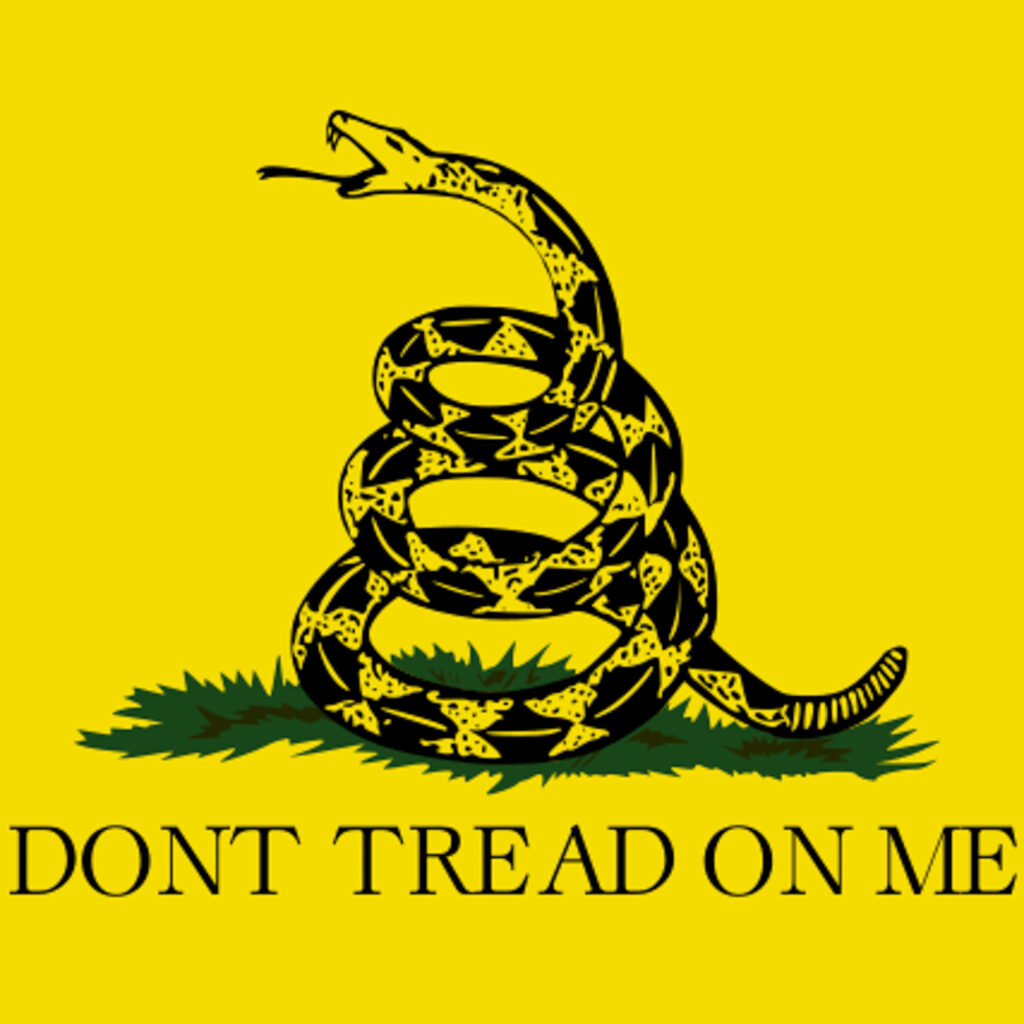
With explicit libertarianism being part of their platform it is easy to connect the dots between their colour choice and the libertarian movement’s adoption of the Gadsden Don’t Tread On Me flag. The Gadsden flag’s meaning within the gun rights community is synonymous with ideologies of independence, freedom, personal defense and the willingness to fight for liberty. In Western Australia the Liberal Democrats have adapted the flag using the state’s emblem - a black swan. However the use of such niche symbolism relevant to a singular state leads to the messaging being lost between different states within Australia.
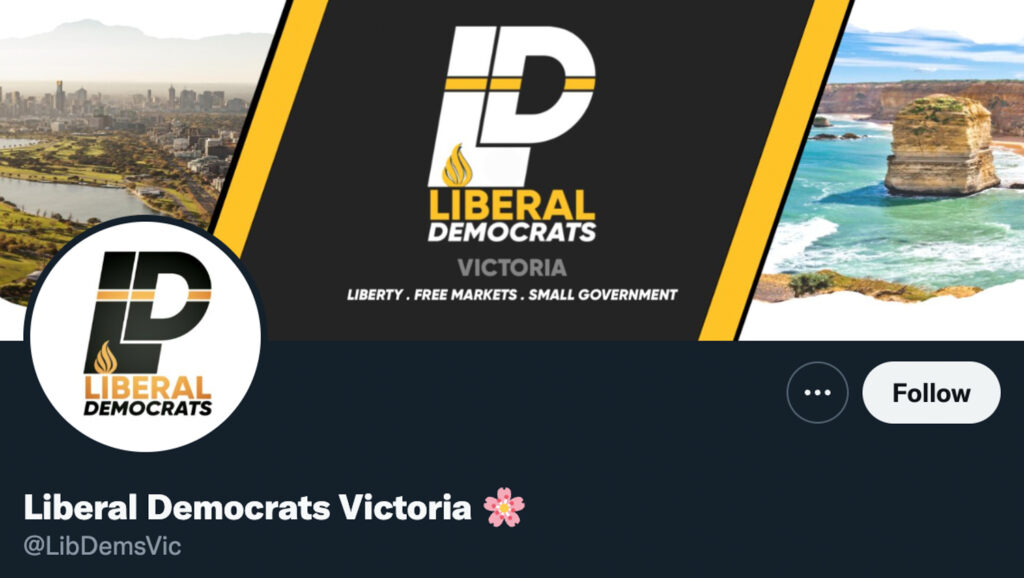
Their transition from the old branding to the new branding was ineffectively rolled out and saw them create an entirely new Instagram profile instead of updating their handles and profile picture. The result is that they now have almost 5000 followers less and significantly fewer engagements with their new posts.

Aside from the updated yellow and black colour palette, there is very little cohesion throughout their collateral. In general, their design work is pedestrian; when looking at the finer details of their designs there is no consistent typeface - instead a mixture of handwritten fonts and san-serif capital case fonts are used. The two-colour scheme is poorly implemented. Whilst yellow is their primary colour some materials use a gold gradient. Gold is notorious for performing poorly digitally and when printed, and also struggles to look anything other than muddy. Inconsistent design is present across their collateral, particularly the bi-line that reads “liberty, free markets, small government” is sometimes presented with full stops and sometimes with commas.
The Liberal Democrats are the only political party using textures throughout their material. Textures are used heavily in political material depicting negative ideas and are therefore not a popular graphic device to use as part of branded material. In social posts presenting party members, a black leather texture is used as a background. Effects used in this way are a basic way of ‘adding more’ to a design without adding any meaning - in short, there is no purpose for this and its purely decorative.
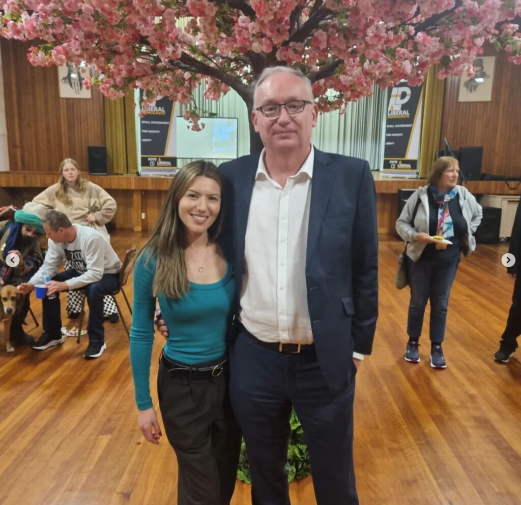
Finding a way to communicate extremist views, such as being anti-vax, without receiving negative public backlash is hard, and outward election campaign material doesn’t explicitly represent these Liberal Democrat stances. Relying on lesser-understood niche symbolism is how the Liberal Democrats have been able to communicate this political stance. In their Twitter handle they have an out-of-place cherry blossom emoji, and at their launch three weeks ago there was a cherry blossom tree. The cherry blossom symbol nods at conspiracy theories and anti-vax beliefs. However a fire emoji would more appropriately and directly circle back to their logo whilst aligning their brand and political identity with a specific emoji - and like we mentioned in The Green’s political design, successfully creating symbol-based identities is powerful. Instead of hopping onto a movement created by someone else, the Liberal Democrats have a missed opportunity to create a movement of their own with the fire emoji.
One of the Liberal Democrat’s ideals include the desire to remove the government from people’s lives and empower the individual and free market. As proponents of this idea, they themselves are failing to live out their ideals in a design sense. One suggestion that would allow them to implement their ideologies throughout their designs could be by having individual candidates create their own sub-brand and design language. Giving their candidates freedom of design would relate back to their desire for a free market. It would also be interesting for them to look at type treatment and how they can streamline their messaging and remove decoration from their material.
The Liberal Democrat’s brand update had some upsides: it distinguished the party from the Liberal Party whilst creating an opportunity for a potential symbol-based brand identity. Taking advantage of the fire symbol, tidying up the collateral and incorporating individualism in their design would help to solidify their branding, more effectively communicate to their audience and ultimately secure more votes.