
The following series will be looking at a range of political parties in Victoria, leading up to the state election on the 26th of November. Pure design in politics is not something that is greatly explored or invested in when compared with advertising, messaging, communications and content. The following series is not a criticism of party platforms or policies and comments regarding design should not be read as either support or disapproval. There is also an understanding that different parties have different budgets, approval processes and infrastructure which make different ideas possible to some and not possible to others. These inequities have been touched on where possible. In this article we will be looking at the Victorian Socialists.
Words by Chris Dansie, Design Director at Hortenzia.
Design is a powerful visual tool for communicating a brand message to an audience in an understandable and convincing way. For a party like the Victorian Socialists that are trying to break their way into Australia’s political scene, design is key to communicating their message. Since 2018 they’ve been working as a socialist political group in Victoria, with a mission to redistribute wealth towards the working class. Given their radical political ideologies, it only makes sense that their drive should be reflected across all touchpoints. But their design falls flat amidst their incohesive collection of campaign materials that are haphazardly pieced together. For an organisation that pledges to “fight for a radical redistribution of wealth and power”, the Victorian Socialist’s brand identity and collateral comes across as tame, sanitised and safe.
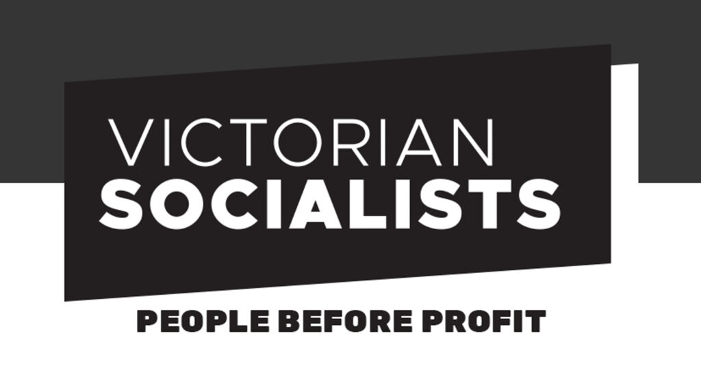
Australia’s political scene is filled with parties whose entire brand is built around a single colour; Labor is red, Liberal is blue, and Greens are, you guessed it, green. As a relatively new party the Victorian Socialists have chosen black as their main colour, which is a smart choice given that other parties cannot pivot and use another colour now as they already have a deep association with their respective colour.
For the Victorian Socialists, Black is also clever because it is a cheaper colour to reproduce, and when photocopied it creates a lo-fi aesthetic that is still visually appealing. The Victorian Socialist’s typeface of choice is Raleway, designed by Matt McInerney, Pablo Impallari and Rodrigo Fuenzalida. The benefit of this type is that it is available on Google Fonts and Adobe Fonts, making it extremely accessible to be implemented across a diverse range of media by multiple designers. Google Fonts are free, and so it can be installed on websites without extra added cost. The typeface supports 318 languages, making it extremely accessible for a large range of audiences including culturally and linguistically diverse communities. On the Victorian Socialists’ websites there are currently 11 languages represented. This level of accessibility is an ideal that is mirrored in their manifesto, “let’s put a socialist in parliament - to fight for all of us”.
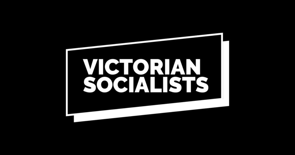

But whilst their branding may allow for cheaper reproduction, varied colour use and accessibility for a variety of languages, it is lacking in other areas. The Victorian Socialist’s logo (left) makes reference to typography on a diagonal axis, discussed here, through the clever logo lock-up device that leaves the wordmark on the x-axis and the box behind it angled. However when formatted to fit into their social media profile pictures, the logo is reduced to a ‘VS’, angled on the opposite diagonal. Design in today’s contemporary society requires every aspect of a brand to be responsive to screen sizes. The clever logo design is lost when crunched down into a tiny circular profile picture (as shown in the right image), and with it their progressive visual design.
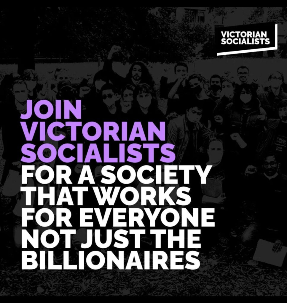
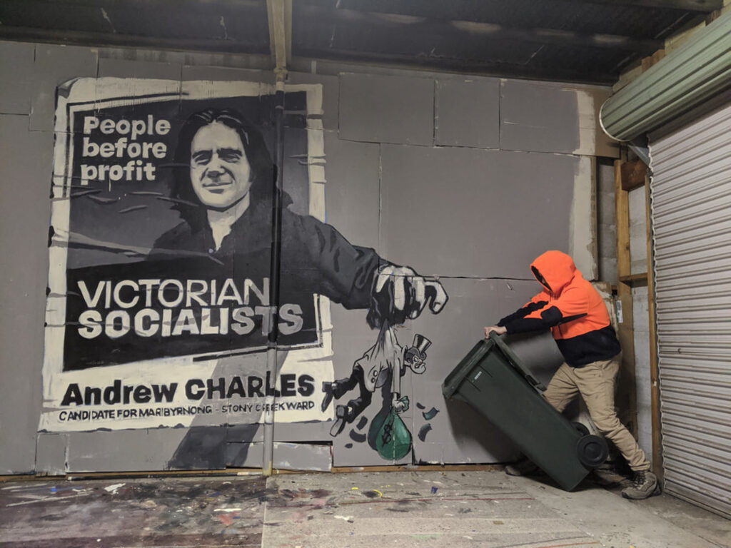
Another area that the Victorian Socialists are lacking in is their choice of imagery. The imagery across their social media depicts activism and protests, highlighting their commitment to direct action. But when it comes to the very people they say they are standing for - the working class - there is very limited representation. Seeing greater visual representation of the working class communities that the Victorian Socialists are fighting for would be a good marriage of action and visuals that their audience can relate to.

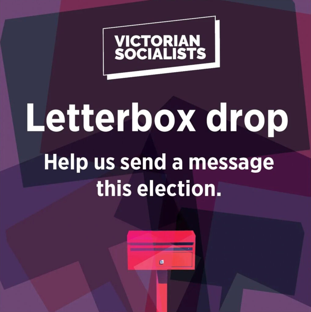

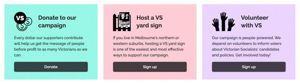
The biggest design flaw across their branding is the lack of cohesion. The above images are all brand collateral produced by the Victorian Socialists, but the varying use of brand colours and design styles make it look like it could be three entirely separate parties. What makes a brand strong is a the consistent use of colours, typography, imagery and overall style that creates a clear image for consumers; when those elements are disregarded then the brand’s value falls apart and messaging can be lost. If consistency cannot be achieved practically and structurally due to the way organisations run, for example with a variety of people and skills creating your material, then embracing a level of inconsistency should be explored - lean into differences and make it part of your branding.
The Victorian Socialists, having only been founded four years ago, are a young organisation that still have the opportunity to adapt their design thinking quicker than larger institutional parties. With a mission of “redistribution of wealth and power”, it would be interesting to see how they can extend on these ideas through experimental designs and design systems. Design is a powerful culture setter, and the power it creates leads to paradigm shifts that slowly but surely reshape what is socially acceptable.