A common feature that is overlooked when it comes to design is accessibility. Accessibility in a design context refers to how all users can use an interface and interact with information or design. In 2022 there is a growing trend of inclusivity that extends to creating design accessible for a wide range of needs. But at the same time, with so many different needs to be aware of and cater towards, it is hard to be accessible for everyone. What factors should a designer take into account when designing a website or interface?

The biggest struggle when it comes to designing for accessibility is knowing what needs have to be adjusted for. Designers should never intentionally design to exclude, unless there are specific design reasons or decisions in doing so. For people that struggle with epilepsy, flashing animations can induce seizures. For visually impaired people, the website text needs to be formatted for screen readers. Outside of disability needs, accessibility can extend to device model and internet speed; someone living in areas with limited internet access will not be able to load a website with high internet demands. Understanding your audience is the first step to understanding what accessibility designs need to be included. An essential service like a government website or domestic abuse hotline should have multiple language options, screen reader compatibility and simple navigation, to name a few.


When engaging in the graphic design process, there are many accessibility concerns to take into consideration such as text sizing on a document or the colour contrast levels between the foreground and background. For example, a person without 20/20 vision can’t be expected to read 7-point size typography in a comfortable or reasonable way. Colour choices are important as they can evoke certain emotions and be a powerful tool for communicating. How colours interact with each other is equally important where you deal with background and foreground colours and differing contrast levels. Styling should not win over accessibility. They should be a partnership that works together to enhance the design and improve the communication.

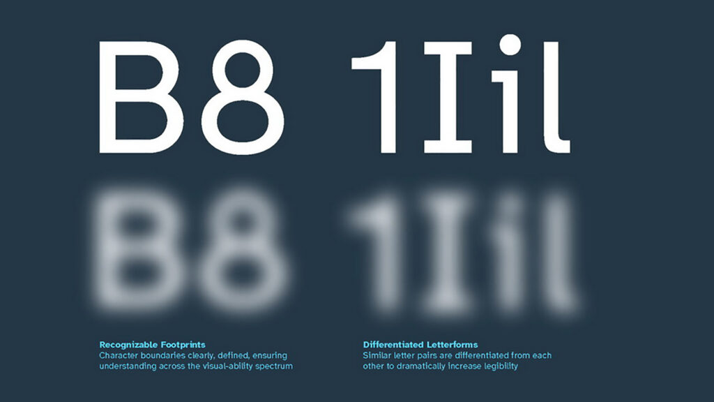
However just because a business like a clothing retail store is not an essential service, it doesn’t mean that people with accessibility needs should not be catered towards, and nor should their lived experience be limited to basic needs. A great example of a design innovation that benefits people with visual impairments is the Braille Institute’s "Atkinson Hyperlegible" font family. The designers took into consideration the struggles that vision-impaired people experience, such as a ‘B’ looking like an ‘8’, or different similar letters being hard to differentiate. Whilst designed to be inclusive, it was also intentionally given a mid-century modernist and neo-grotesque style, inspired by the brutalist architecture of the Braille Institute’s physical building. Simply creating large and ugly font options that were readable would have reinforced a message that visually impaired people are not worth the design effort. It is important to be aware of the fact that in an attempt to be accessible, businesses can run the risk of unintentionally undermining the worth of the people they’re trying to include.

Accessible design can be expensive to implement, and more often than not it is considered as an add-on rather than a need. Creating large changes that only target a small fraction of the population is an unneeded burden many companies and designers prefer not to take on board. But design that is accessible is important as it should consider all audiences - both within the expected target market and potential new audiences. What makes the Braille Institute’s design great is that it not only helps accessibility, but can create active change by helping hard of vision people participate in the workforce. There are an estimated 2.2 billion people with a vision impairment, and the World Health Organisation estimates that vision impairment leads to “an estimate annual global productivity loss of about US$ 411 billion purchasing power parity”. The cost of creating accessibility is far outweighed by the potential benefits it gives way to.

There are many financial downsides and obstacles in the case for promoting accessible design. But there are also upsides; designing for accessibility makes your product or service more human. It encourages you to empathise with the struggles of others, and it creates a world where people with extra needs are given an opportunity to participate in day-to-day life.
