Midsumma is an Australian queer arts and cultural organisation. Their primary yearly event Midsumma Festival has been running in Melbourne’s warmer months with a series of queer events and artists since 1989. Out of the attempts by GayDay and the Victorian AID Council proposal, Midsumma was created with a genuine pride in the distinct and growing Melbourne gay community, as well as potential party economics after witnessing the success of Mardi Gras in Sydney. It was a complex festival with no parade but instead a program including a film festival, art exhibitions and a sporting carnival to distinguish itself from its Sydney sister. The organisation ran the festival under tight budgets for the first few years until the mid 90s where they slowly gained reputation and developed a working system. In 1997 the festival had the very first female president which marks another important step of making the festival not only for gays, but for the broader LGBTQIA+ community including lesbians and drag queens. And as the 1st Asia Pacific Outgames was held in Melbourne in 2008, the organisation became a cultural partner of the game and has grown to become Victoria's premier LGBTQIA+ arts and culture festival since then.
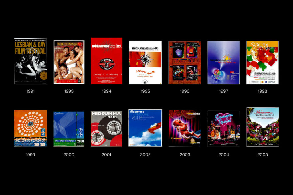
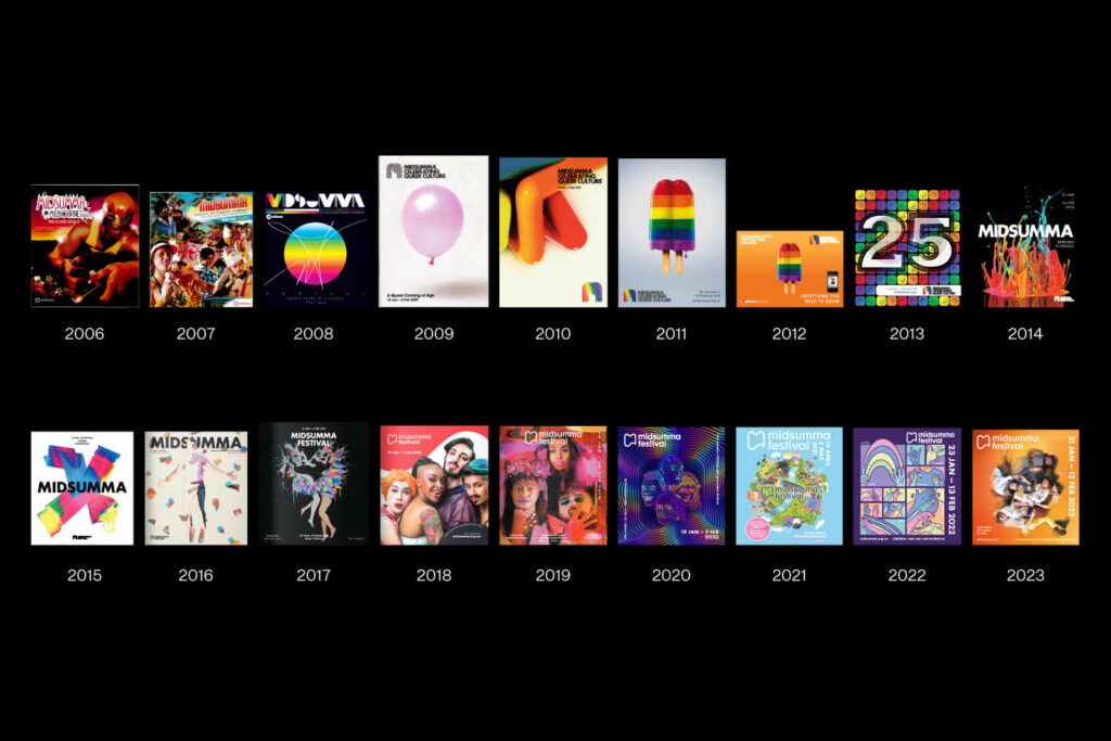
As Midsumma has now spanned 34 years and is part of the zeitgeist, we are looking at the ‘front cover’ or the poster design and its evolution over time. Looking at this series we can see how the design has changed, not only with design trends but with the evolution of technology, knowledge and societal progression. We can see the implications of wider communication mediums influencing the designs, mainly the last ten years where elements have been designed to translate beyond the poster format. This snapshot helps demonstrate the circular nature of visual mediums informing queer culture and queer culture informing visual mediums like graphic design.
Cultural experience and history are preserved in visual format, and design in this case has served as a tool of communication and self-expression throughout the community, especially within the queer community itself.

Throughout the 90s, we can see an avoidance of the use of rainbows or colours of the rainbow as a major design element. However from 2007-2008 onwards as the organisation solidified its standing as one of the prominent queer organisations in Victoria, we can see the introduction of the rainbow colour scheme and a celebration of this design element up until 2017 when the same sex marriage laws were passed in Australia, followed by a transition towards inclusiveness as a design theme and in the imagery used. There have been different symbols, motifs and design ideas present for different periods of time such as the sun motif that is present from 1991-1998 and integrated into the designs in quite radically different ways. The distinctive line work logo runs from 2009-2014 where it stopped being used as the festival moves more towards a simplified symbol that can be used across many different mediums and reproduced at many different sizes, as the transition to more digital friendly designs appear.

It is important within the design community to have an understanding of the history of Australian design and the perspective of this through a queer cultural lens. This knowledge and understanding can only assist us as designers as we seek to be more inclusive with our design, as well as our actions now and into the future.
